Guide to Email Design and Best Practices
Inboxes today are full of emails – promotional, personal, social – arriving in the inbox every day; subscribers are just scanning rather than reading them.
So, the main goal of email marketers is to be able to express the email’s purpose in the shortest possible time. That’s where a well-designed email sent according to the best standards can help.
Email design encompasses far more than its aesthetic appeal or content. It should be consistent with the sender’s brand and resonate with the recipient at every touchpoint.
A good email design also ensures a positive experience for the recipient, regardless of their device choices or accessibility routes.
The best email design is something that goes unnoticed – It seems natural and immediately connects with the recipient!
The Value Email Design Adds to Email Marketing Success

Effective email design strategies transform a standard email scan into an intelligent one, delivering a deliberate message. Well-planned and implemented email design best practices accomplish three key objectives:
- It drives the recipients to open the emails.
- Entice them to read the complete email and its every component.
- Persuades them to take the intended action.
With solid email design comes the opportunity to strengthen the relationship with the target audience, build a brand image, generate more and better revenue, and increase the overall email marketing return on investment.
The ideal ratio in email design encourages individuals to gravitate toward email elements that elicit pleasant emotions.
A good email design is about how it looks; it’s also about how it works. The email design should be eye-catching, aesthetically pleasing, high converting, and on-brand – let’s look at some best practices and things to think about when designing an email.
Before the Email Design Process: Considerations to Keep in Mind
The technological aspects of the email design technique create the perfect communication bridge between the email marketer and the subscribers.
1. Accessibility
A well-designed email layout is essential for accessibility. It’s critical to make the email readable for all of the email list’s contacts, including visually challenged ones.
Using descriptive alt text for any images or graphics used in the emails and an appropriate backdrop colour facilitates ease of reading.
An accessible email design expands the outreach as more and more individuals will be able to read and interact with the emails and their content.
Avoid Large File Sizes: A no-no uses large image file sizes in emails. They can take a long time to load, which is inconvenient if the window of opportunity to grab the recipients’ attention is just a few milliseconds. Nobody wants to irritate their subscribers by making them wait too long for the emails to load or pay for the data that the enormous image has squandered.
Bandwidth: The email design should be able to convey the message no matter what is the bandwidth of the recipient’s network.
Email-complementing Images: An image should match and support the email and its content and not replace it. Viewing the email without images turned off is a simple method to test this. Is the email still comprehensible? Is it still apparent what the core message in the email is? You must maintain a balanced text-to-image ratio in the email.
Proper Navigation: A navigation bar can be helpful if the email has many segments to show. To improve visual focus, limit the email to four or five parts.
2. Responsive Email Design

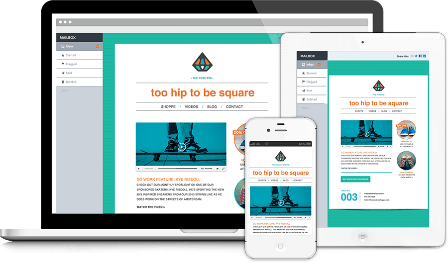
With more than half of email users viewing emails on mobile devices, email templates can’t be designed solely for large desktop screens. Building responsive emails is the most delicate approach to ensure that all receivers have the best possible experience.
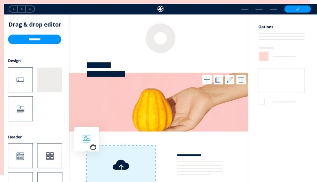
Choose an email marketing tool that offers responsive email templates. Also, it can have a drag and drop email builder that creates responsive emails. The emails created through these tools automatically change the email content layout according to the screen size and device.
A responsive email will look great on small and large screens and improve email retention across all devices. And, since the emails are built and optimised for different screen sizes, it won’t make a difference if the subscriber uses any device or browser to access the email.
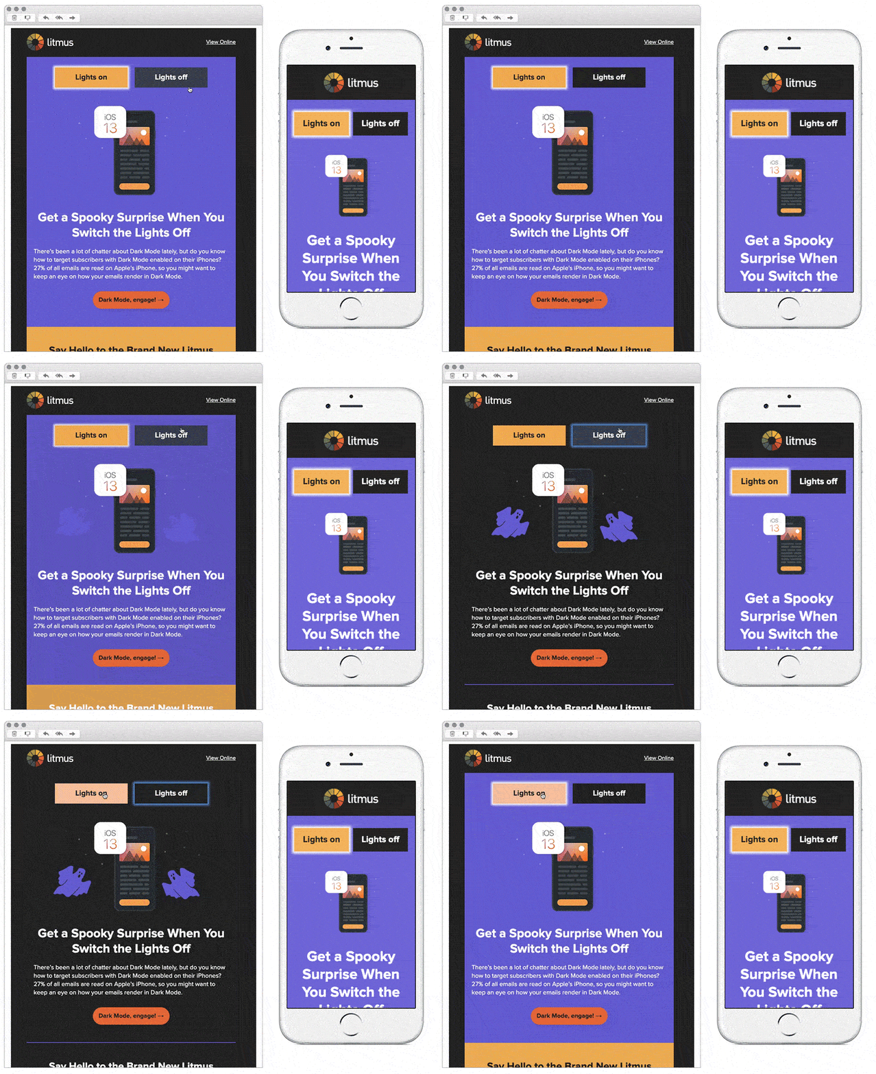
- Do not forget to design emails to work optimally in dark and light modes.
- Design the emails for different breaking points.
- Different browsers and devices render the emails differently. The Thumb rule to win this situation is to test everything.
3. User Experience
Nobody wants to read a cluttered, disorganised email; it makes receivers feel overwhelmed and increases the likelihood of desertion.
Hence, the user experience must be at the top of mind while designing emails, leaving enough white space, using the right supported font families, creating a clear visual hierarchy, and strategically placing textual and visual content to make it easy to consume.
Interactive components offer a gaming experience within the email, which lowers barriers to engagement and improves the user experience by allowing subscribers to interact with email without having to follow links. This is crucial for obtaining high-intent email clicks.
4. Play Strategically with Images, Graphics and their Placement
- Choose high-resolution pictures and images for the emails and avoid non-stock images.
- Depending upon the email marketing campaign type, its goal, what it offers to the subscribers or what action the email wants to receive from the recipients, place the images accordingly in the email.
- Whenever possible, use personalised photos.
- GIFs increase the engagement rates with the emails and turn the email design fun and interactive.
5. Email Layout

The email layout is an essential aspect of email design as it directs the recipients to what they should look at first and where they can proceed from there.
The email reader should be able to swiftly skim the email via a logical structure with main headers, pre-headers, and visuals drawing attention to the most critical information. You can use layout to break up space and aid in creating content sections.
Inverted Pyramid
This kind of email framework organises the pieces of emails – headers, pre-headers, body, images, buttons, and so forth – in a manner that they work together to pull people in and communicate the campaign’s central message and persuade them to click through.
Zigzag Layout
Another successful email design layout is an angular design grid with a zigzag layout. You can do this with graphics or colour blocking to walk the reader into each email step. Such an email design produces a visually appealing structure and aids in the simplification of each section of the email, making it easier to read.
Single Column
One or single column email design functions well on desktop and mobile devices. These mobile-first email designs frequently resize pictures and adapt to desktops. It assists customers in navigating email without overwhelming them. The one-column layout makes it apparent what information is crucial and directs the email recipient to the next step.
6. A/B Testing
Email design is an iterative method. It relies on analytics and audience response to identifying what works and what does not. Getting the most out of email design necessitates upgrades and changes to the design and layout.
Experiment with different email design ideas with the help of A/B testing to see which one works better with the target audience.
A/B test different design aspects of the email. Don’t be scared to try out as many different elements as possible. Make sure the final email design is the most effective in terms of reach, engagement, and conversion.
Ace the Perfect Email Design
Email Width
To be safe in terms of content optimisation, the recommended email width for legible and accessible emails is 600 pixels, with the maximum limit at 640 pixels. Also, prefer a vertical layout over a horizontal one.
600px may seem paradoxical initially, especially given the increasing size of the display screens these days, but bear in mind that not all email services work similarly.
The emails will be shown in a frame surrounded by multiple sections and tabs in many inboxes.
Additionally, email services do not display email messages in their entirety on the screen. Some display advertisements or feature navigation or a menu, limiting the screen space available.
Clean, Crisp, Coherent and Simple Email Design

Email design jam-packed with many elements can be overpowering to read and understand.
Keeping the email design visually basic, regardless of how short or long it is, will go a long way toward enhancing comprehension, click-through rates, and time spent reading it. Such types of emails will not turn people off.
Visually streamlined emails enhance the reading experience and have a long-term impact on subscriber retention and open email rates.
- The email’s value points should be in the spotlight and appear in front of the email straight away.
- An easy-going and straightforward email copy, graphics, and overall email design work wonders.
- To improve accessibility and clarity, the contrast in the email design must be high.
- Many email providers do not support background pictures, so it’s best to avoid them while designing the emails.
- Maintain the optimal length of characters in the email copy.
- Ensure a logical flow and continuity amongst different email design components.
- Employ web-safe typography and font sizes for consistency and on-brand experience. Minimum body copy font-size: 14 pixels. Minimum title copy font-size: 22 pixels.
Mobile Optimised Email Design and Interface

There are a few methods for responsive email designs, such as using media queries and creating a fluid email newsletter design. However, consider creating two separate emails:
1. One, set out to create a mobile-optimised and -friendly experience. 2. Second. for a more convenient desktop experience.
It’s becoming easier to customise email experiences with today’s latest technology, available with any professional and feature-rich email marketing tool. A well-designed and highly optimised mobile email experience can significantly improve mobile email metrics.
Use the following tips to create a mobile-optimised email design:
- Use a straightforward and easy to click call-to-action (CTA) button.
- Keep the subject line of the email brief.
- Utilise the pre-header text.
- Use as minimal body copy as possible.
- Ensure that the images, pictures, or other graphics in the emails are not too small or complex to see when viewing on a mobile device.
- The default text size should be large.
- Optimise the size of the images for ease of viewing.
Test, Test And Test!
Always test the email designs to determine if they work effectively on various email clients, browsers, and devices. Double-check the positioning of all email design components. Examine the emails for compatibility and accessibility across a range of bandwidths and modes. Keep testing for other email design variables as well and iterate.
Takeaway
A compelling email design uses a logical hierarchy to clearly state what the email recipient should look at first, allowing for easy scanning and facilitating further interaction with the email.
Keeping an eye on the latest email design trends and following the best practices mentioned in the guide above makes designing an email easy.
- The foundation of building a commendable responsive email design is a short and sweet email with minimal elements that provide value to the email recipient.
- Ensure that email design is on-brand.
- People place a higher value on larger objects, so try presenting the most critical information in big blocks with prominent frames, larger fonts and heavy weightage.
The end-user must be at the centre of all the email design efforts – personalisation, intuitive user experience, and convenience of reading.